Disclaimer font is one of my favourite, because it's like
a twisted stamp, like a maze, very urban-like, but also tall and elegant.
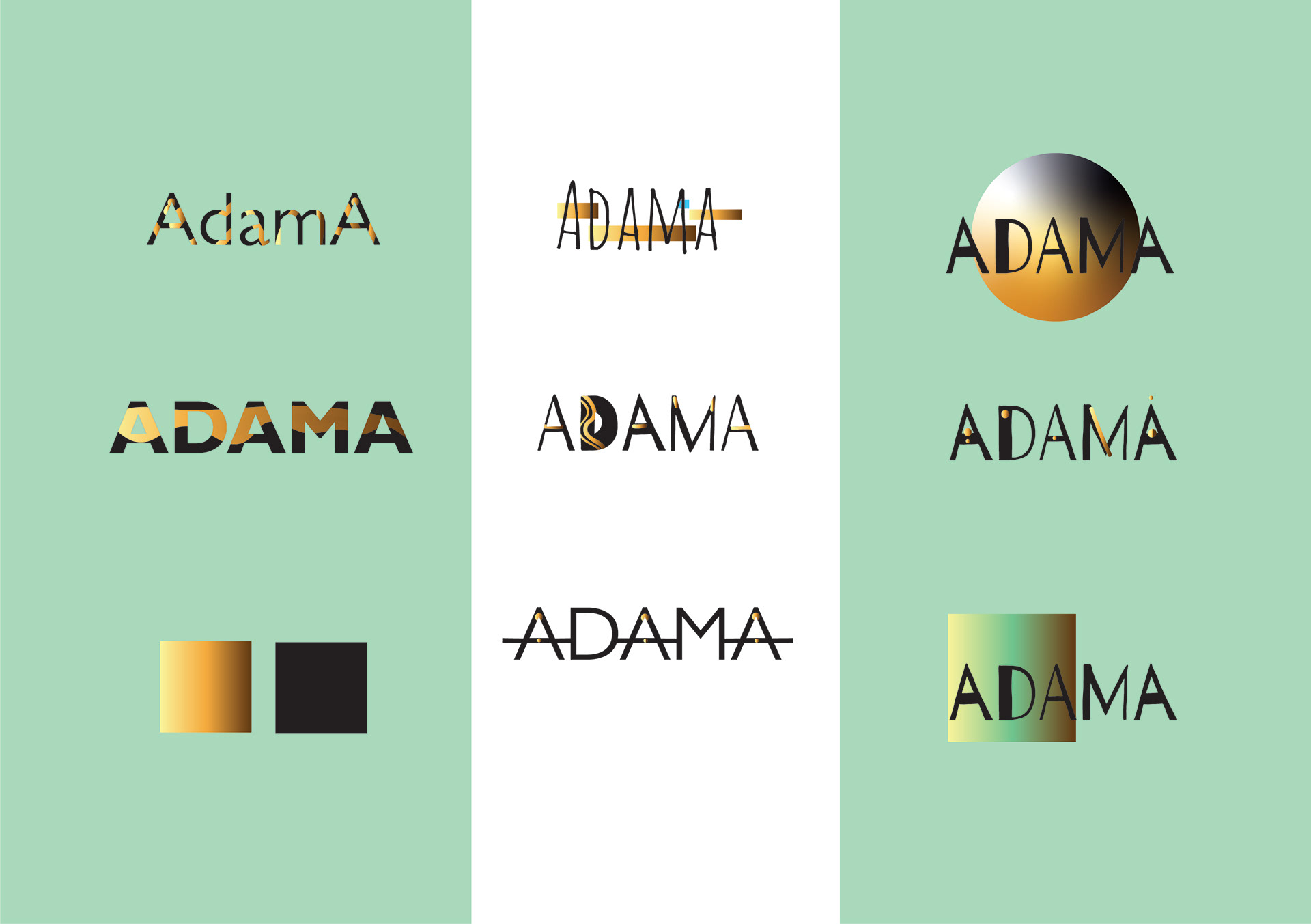
Easy to use on any surface, this”barcode” fits my logotype needs.

@thanks fontfabric
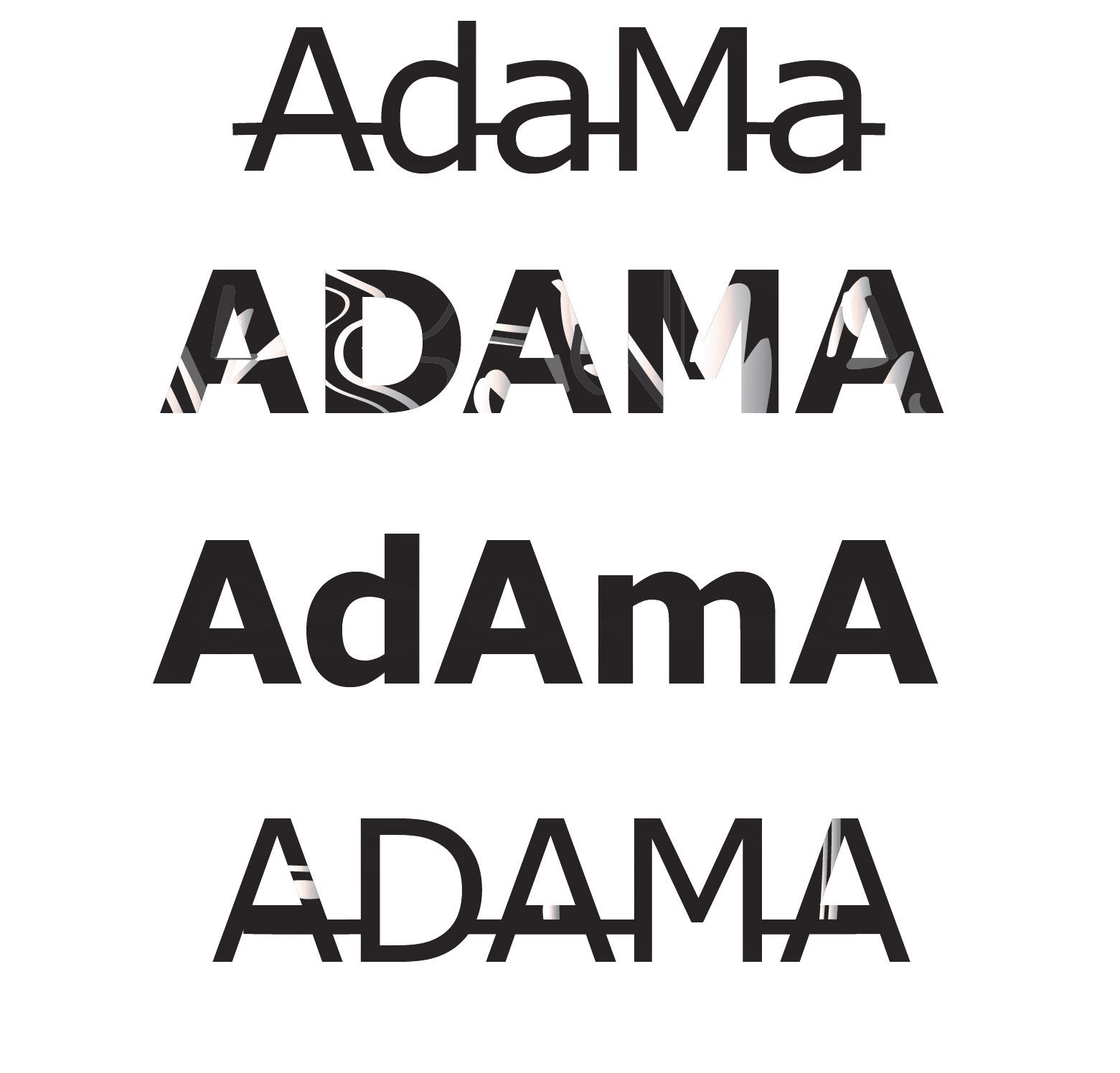
Before i found a decent logotype, I was really struggling because of my newbie view of typography,
but I am not afraid to show them, it's part of my journey.
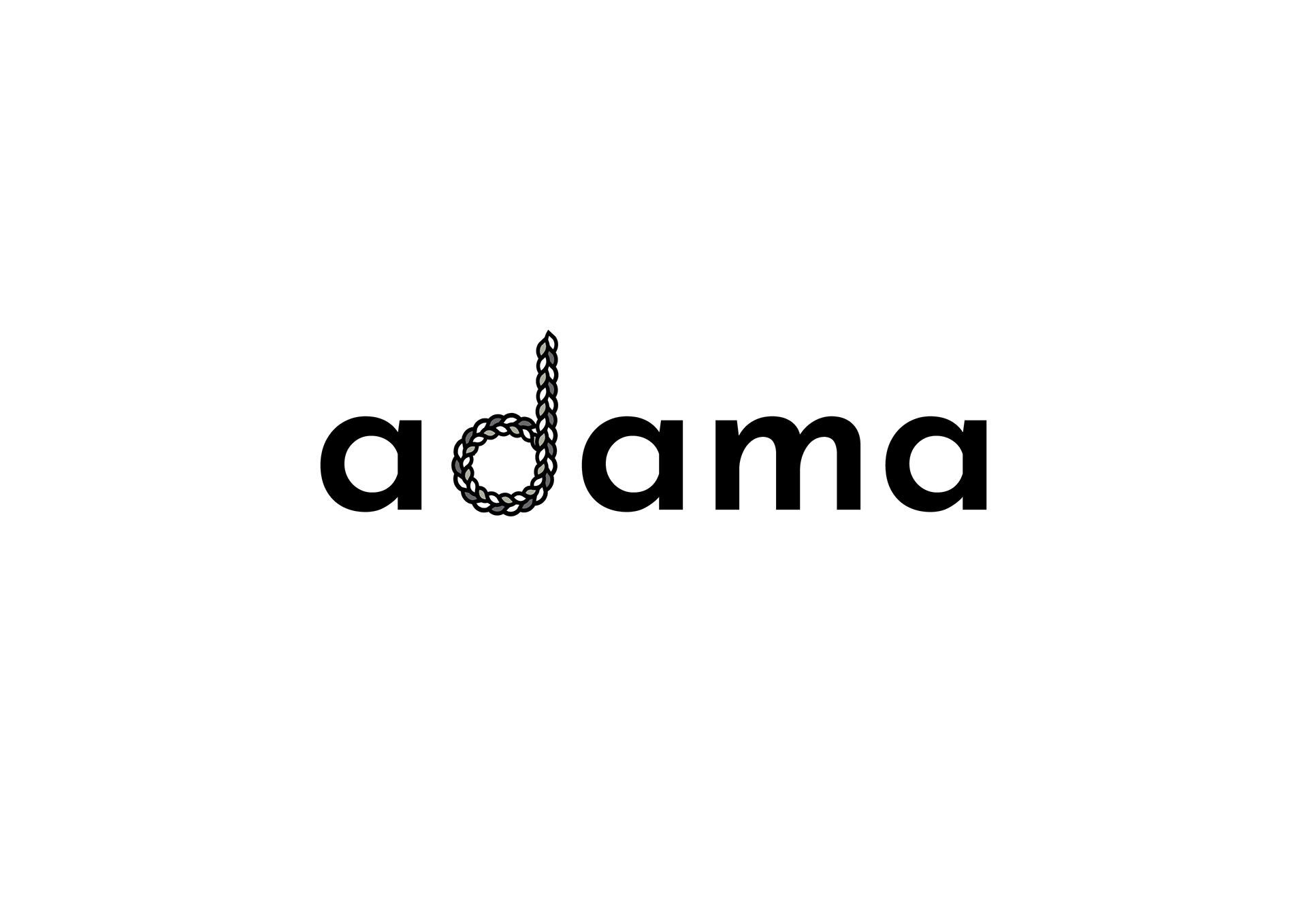
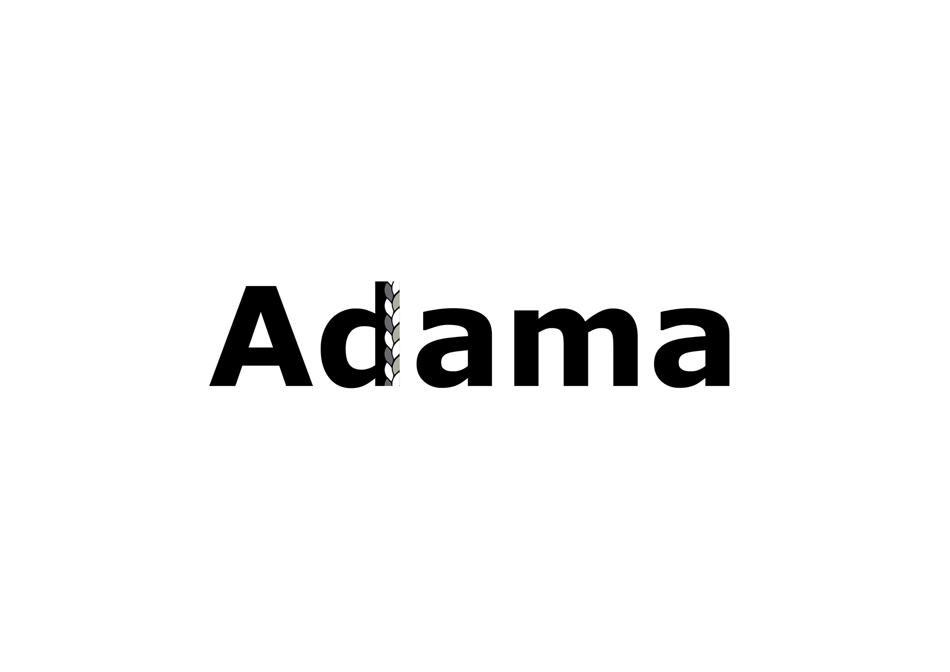
(josefin sans for the logotype above, and the braided letter d, stylized in illustrator)
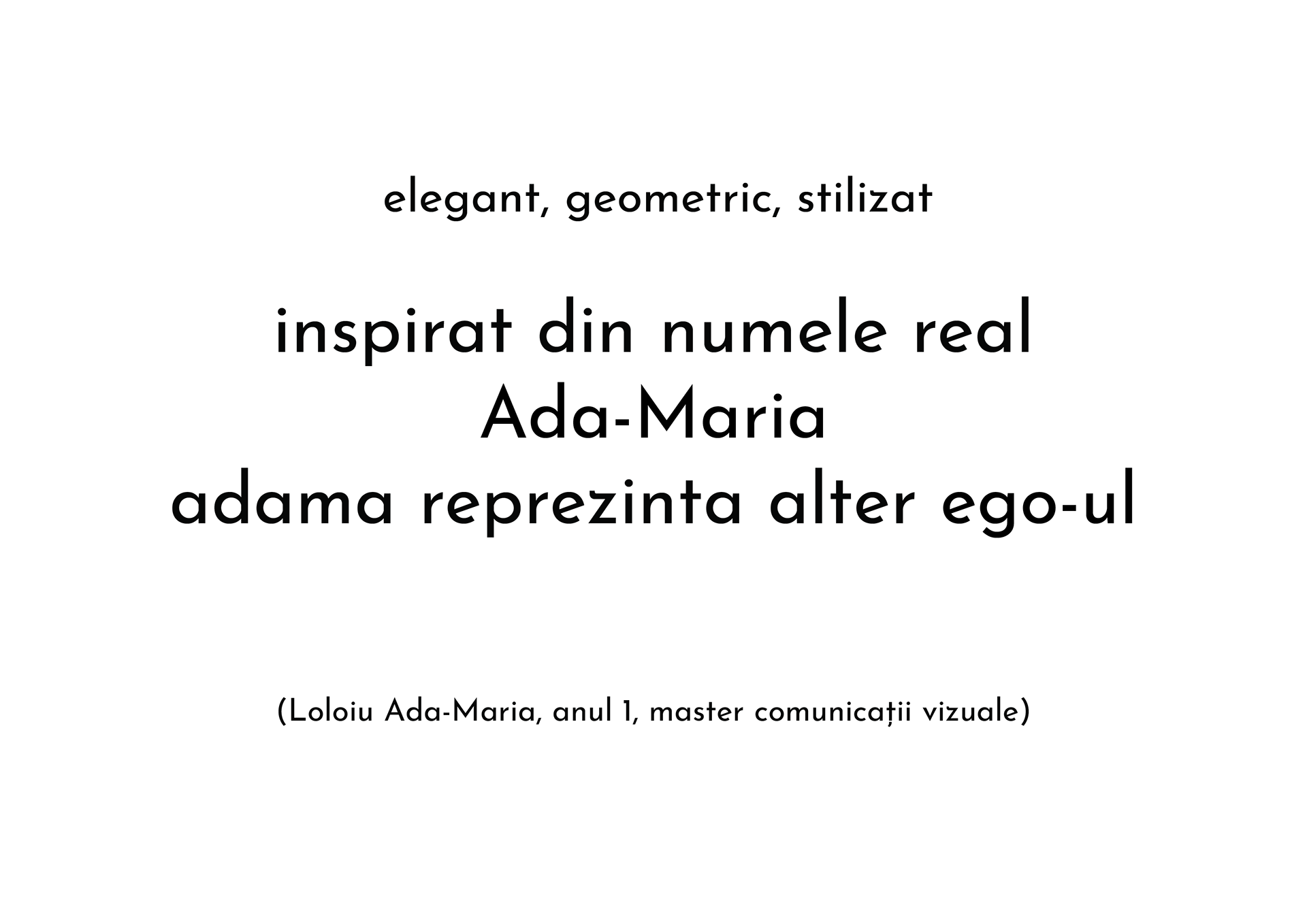
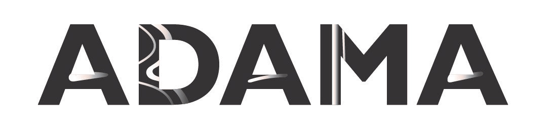
elegant, geometric, stylized
inspired by my real name,
Ada-Maria,
adama represents the alter-ego_
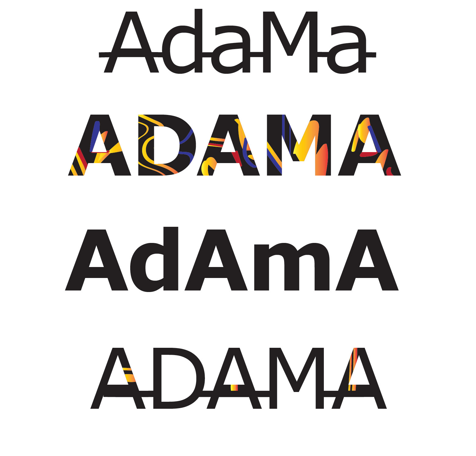
verdana bold typeface for those other experiments
yes, it was a loong searching..
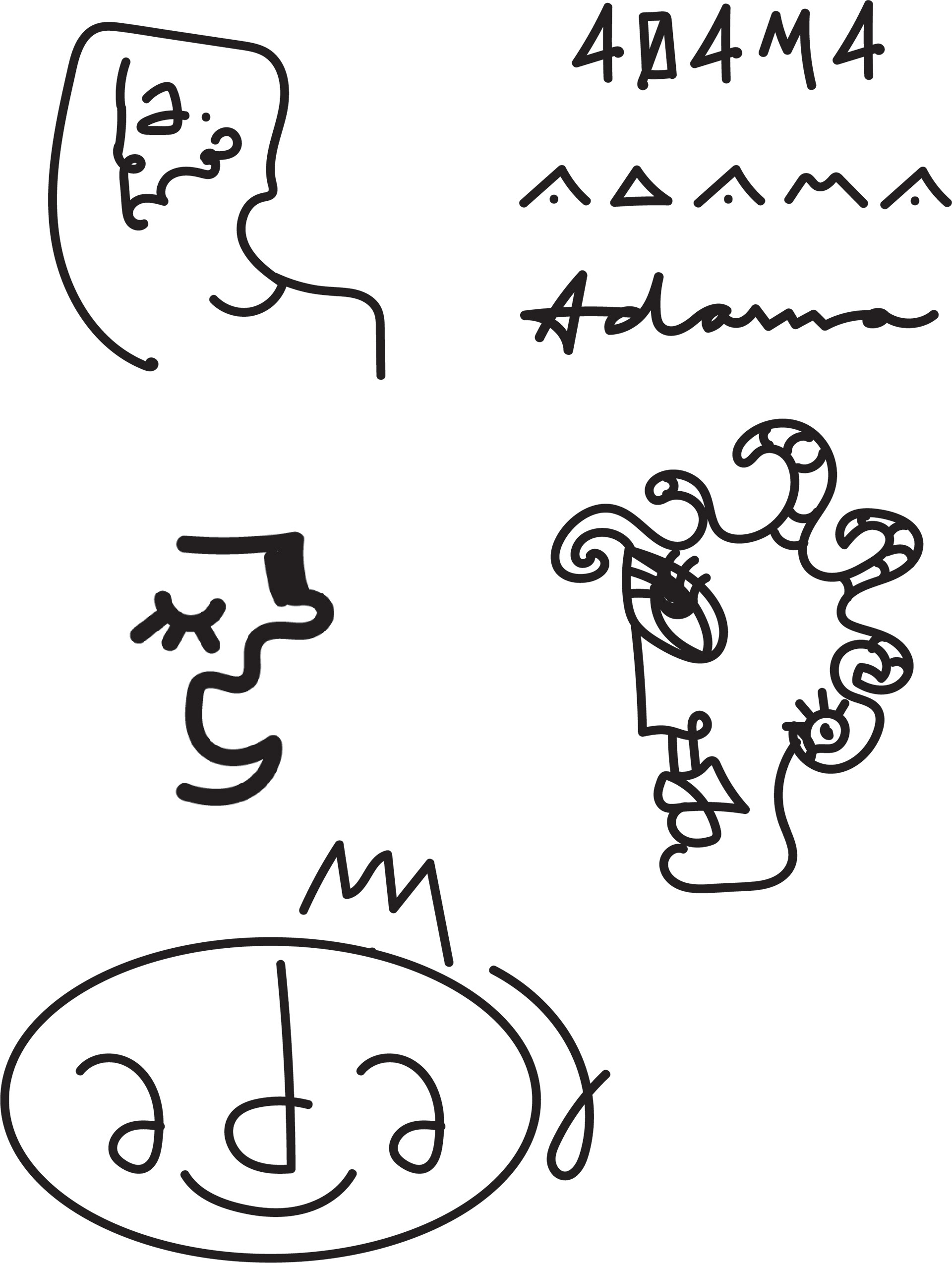
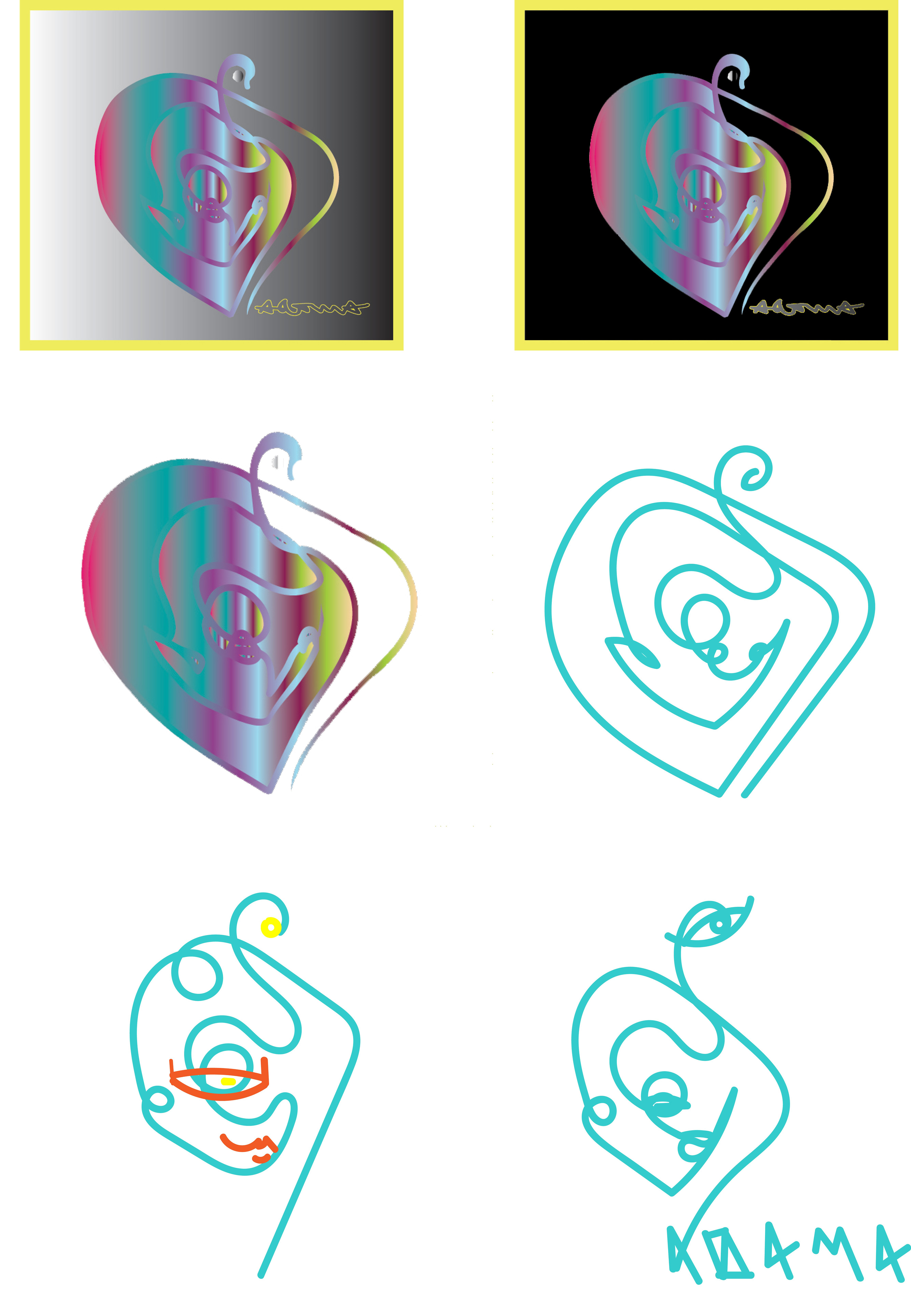
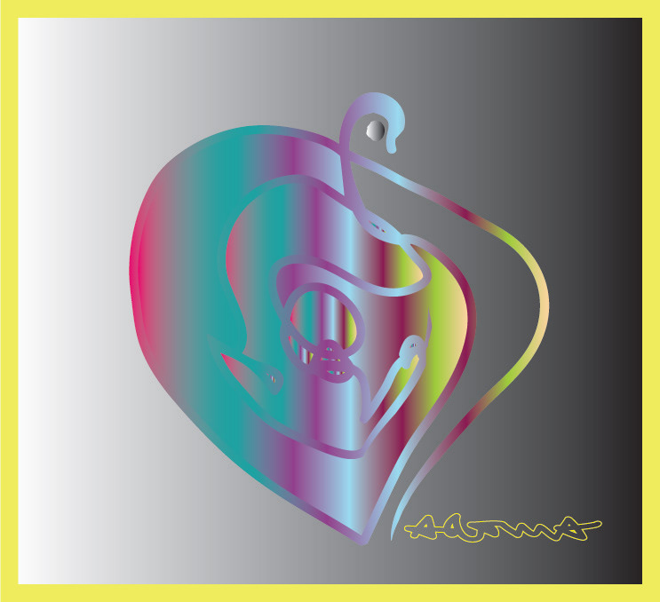
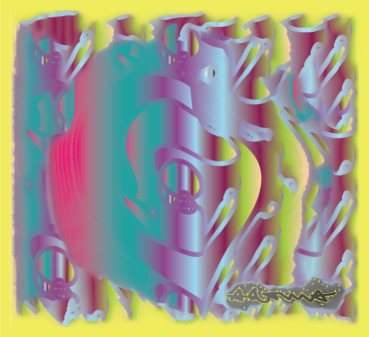
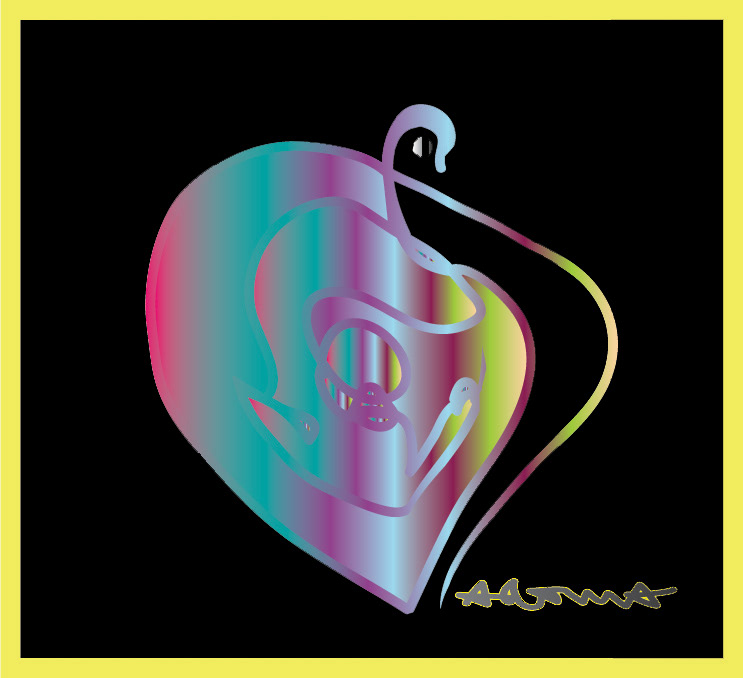


Here are some experiments in illustrator, those were really weird and confusing hand-drawn entities, in the left we have some minimalized profile characters, the first one has the letter ”a” instead of the eye, and in the right page I sketched a little alien head, inside of an heart- shaped gradient (as the logo icon, but dropped the idea )
These came naturally while I wanted to start with the logo, even if they are not good examples to follow, it felt good experimenting and playing